Diving into the Redesign
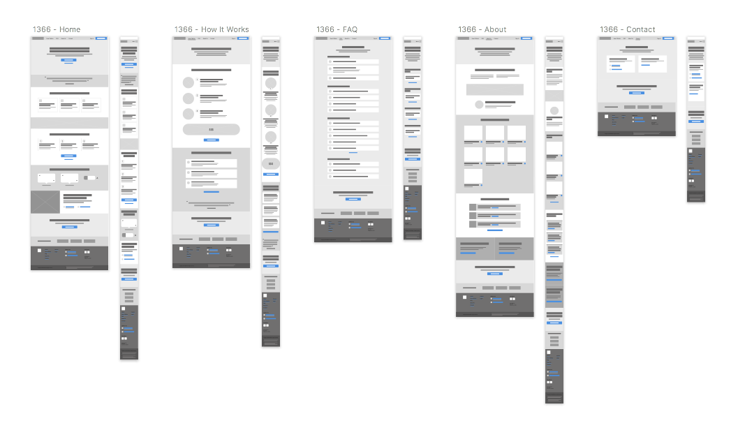
We needed to flip the marketing site, fast. With this project as my primary focus, I established a rough timeline and turned my attention to aligning our goals and strategy. I drew on competitive analysis to form a baseline as we determined our direction and the major pieces of information we needed to surface to customers. Once we had settled on a content-driven outline and core best practices, I set out to wireframe the major moments of the new site – on the Homepage, How It Works, FAQs, About Us, and Contact pages. I worked with Product, Marketing, and Engineering leaders to flesh out the details of each area.
With information architecture in a good place, I explored visual directions. The loan and refinance industry was cluttered with sterile and often outdated and clunky websites. We needed ours to stand apart and we needed to evolve our brand and design language in order to do so. For visual inspiration, we looked to our "North Stars" of design (in this case, companies who also offer complex products and manage to strike a great balance of approachability and tech-enabled expertise). These so-called spiritual competitors included Lemonade (home + rental insurance) and TurboTax among others.
Based on my research, I recommended we aim to emanate institutional expertise and friendly support in our design communication. We needed to match user expectations of what a financial service should look like. But we also needed to leverage our competitive advantages – robust technology and stellar customer support.
For most major site redesigns, I would strongly advocate to pause in these early stages and test assumptions. You can save weeks (and months) of wasted time and effort by simply taking a few days to gauge reactions from target customers. However, this was an exceptional scenario for our lean team. Our priority was to flip the marketing site as quickly as possible – any thoughtful updates rooted in best practices would be a step in the right direction. Testing would come later in this particular process.
Visuals: From Illustration to Animation
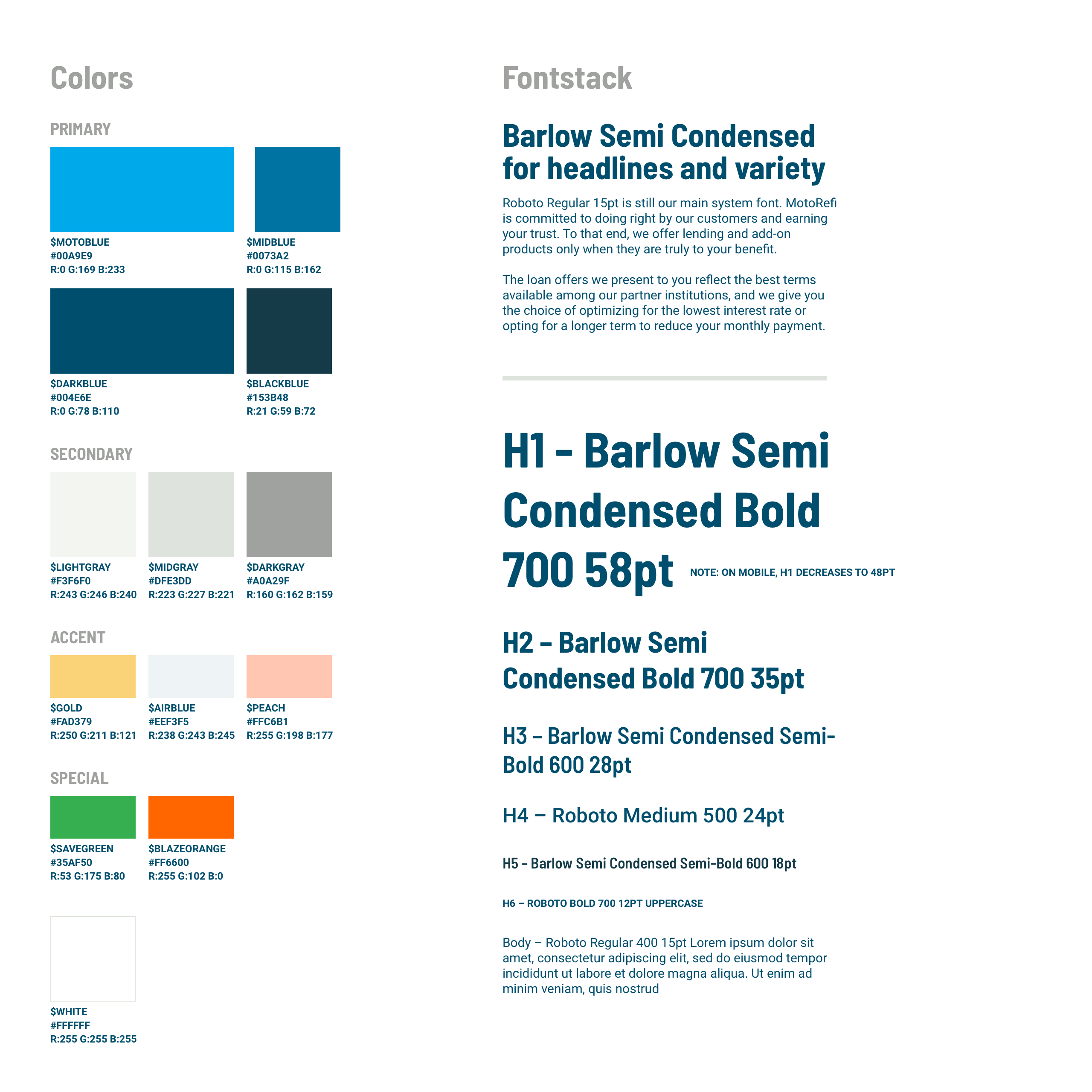
The original company brand guide was limited. Our colors consisted of vibrant blue and green, a few supporting shades of dark blue and gray, and a shock of orange that signaled any issues in the product flow. I knew we would need to incorporate illustration into the marketing site as too many stock photos of people and cars would appear phony and dull. So, I set to work firming up our set of primary blues, secondary shades of gray (warming them up slightly to better convey approachability), and introduced a new set of accent colors – gold and peach – to help bring our illustrations to life.
I also set out to find a new headline font to complement our system-wide Roboto. Barlow Semi Condensed has a cheerful affect but can still be taken seriously. I chose the semi-condensed version knowing that some of our headlines and content could get quite lengthy.
From there I was off to the races. Working as a solo designer, it was an intimidating task to tackle all of the visuals but I was excited for the challenge.
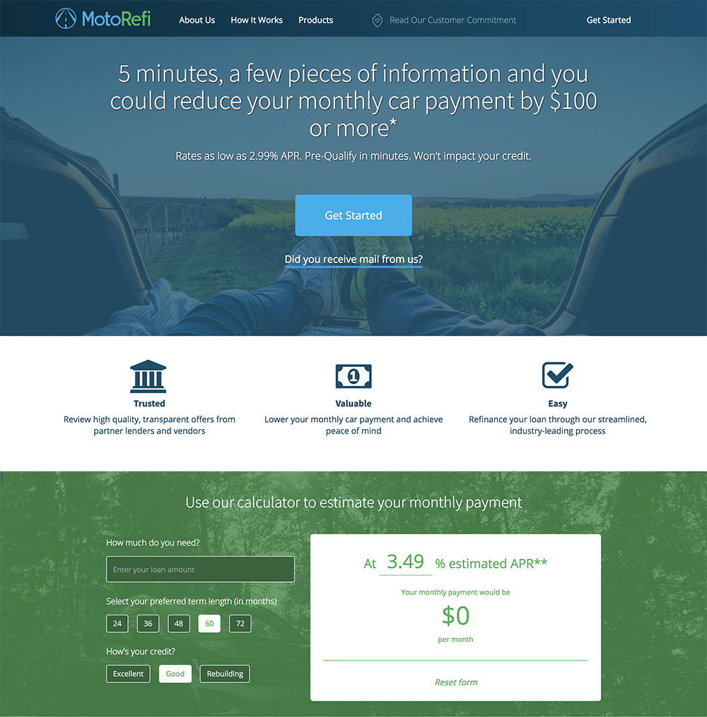
To gain trust points with prospective customers, we incorporated our Better Business Bureau (BBB) badge and rating as well as customer testimonials. We also included partner logos who already had brand traction with our audience (e.g. Equifax, TransUnion, CarFax).
In our post-launch user testing, participants mentioned that the partner logos should be more prominent. As one user put it, "these companies wouldn't work with MotoRefi if it wasn't a legitimate business". In the ensuing round of iteration that I led, I replaced a customer testimonial right below the hero image with the familiar company logos, helping to further legitimize our web presence.
Why did I choose to replace the testimonial, you may be asking? Well, another interesting finding from our research was that about 1 of every 3 test participants didn't trust testimonials at all. A few of the users I interviewed mentioned that they believe companies write their own reviews! Armed with this newfound knowledge, we swapped out the featured testimonial (rather than find another place for it).
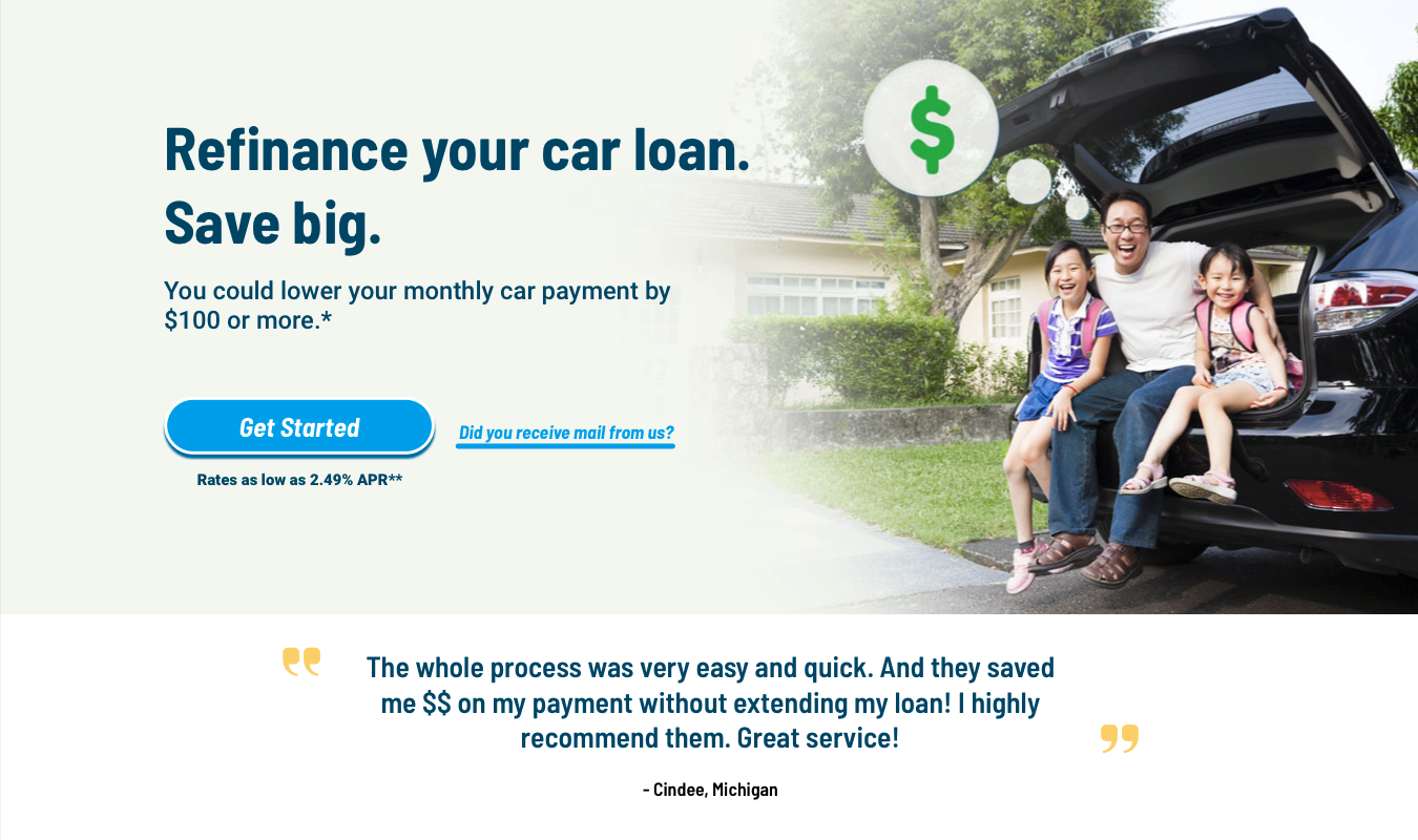
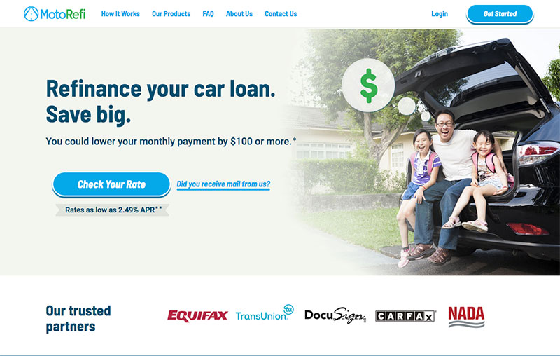
Before: Originally the hero was followed by a glowing customer testimonial.
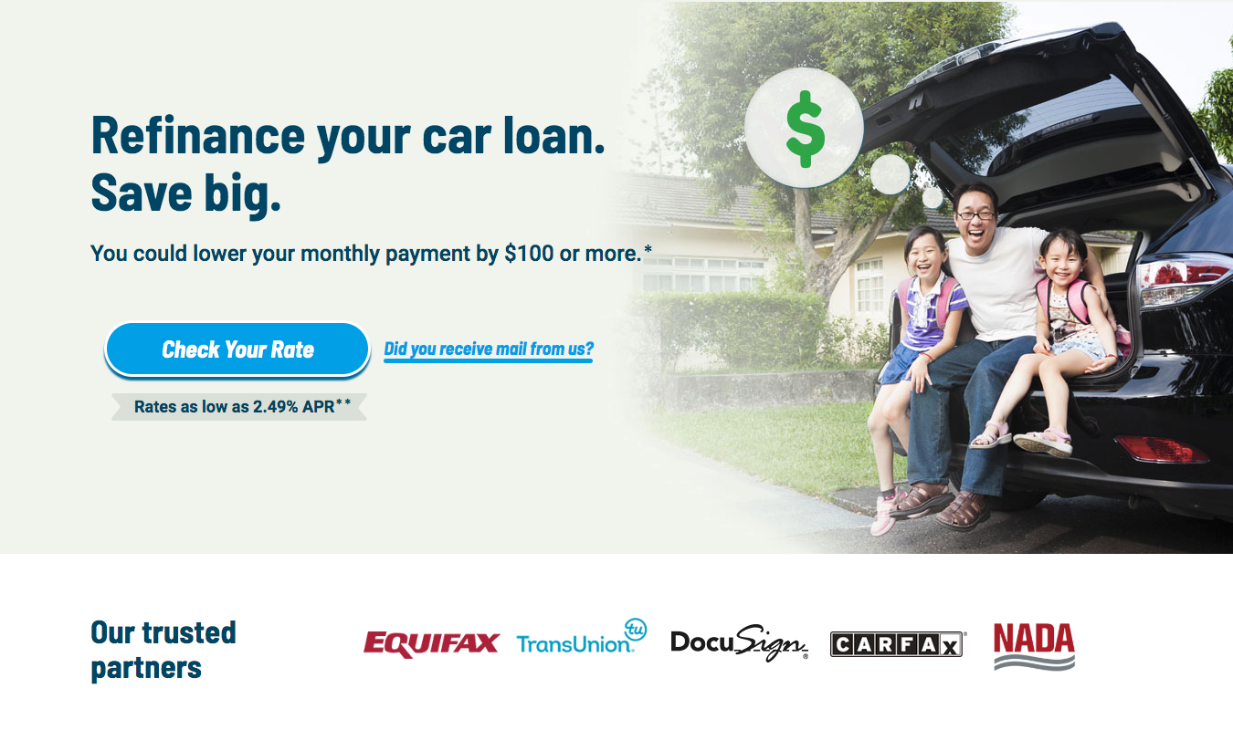
After: User testing led us to show the familiar partner logos immediately upon landing on the site.
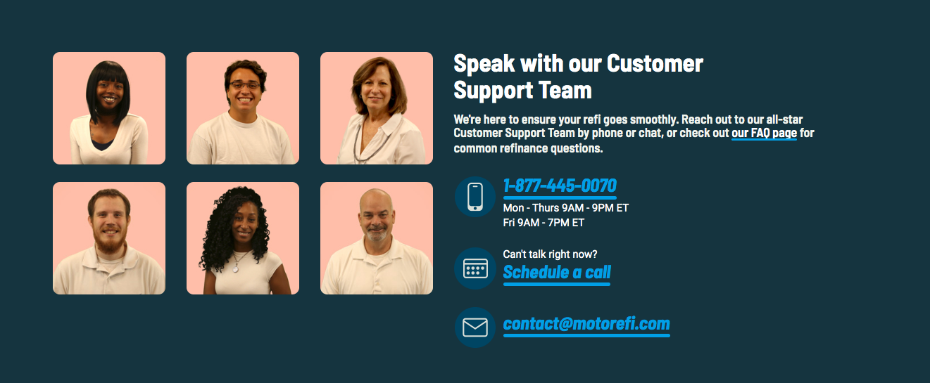
One of the areas I strongly pushed for was including headshots of our support team members next to the company’s contact information. This wasn't because we've got some of the best smiles in the business (I’m biased). Our customers consistently raved about our support team. And in the world of digital finance, speaking with a human has unfortunately become a rarity. Our stellar support is one of MotoRefi’s competitive edges and a strong reason to draw attention to our team.
Our post-launch user testing confirmed that my assumption was correct. The majority of participants commented on the headshots as a positive feature and one that encouraged their trust in us.
Something new we learned from testing: similar to the minority of users who distrusted testimonials, there was a small subgroup of users who didn't trust headshots. A few participants mentioned that they didn't believe these photos were actually real people who worked for MotoRefi. (On one hand, I was flattered that the photos I had shot and edited with a cheap green screen were being interpretted as professional stock photos. On the other hand, we would need to find a better long-term solution that would make these headshots more personalized to our company.)