A Technical Job Search

Platform Design 2017

Project Summary
A recruiting firm approached our design agency to get their manual process online and outsource some of the legwork to their clients. We designed a modern platform that equally balances the needs of both the technical job seekers and the companies looking to hire.
Skill Areas
  • Information Architecture
  • Mobile Visual Design
  • Strategy

Project Background

In early spring of 2017, I was working with Brave UX, a digital agency making a name for itself in Washington, D.C. We were approached by a local staffing agency focused on IT professionals. They wanted to reshape how they recruit candidates and staff firms and put the bulk of their recruitment process online. This would allow them to do less on-the-ground work and ultimately draw in larger numbers of job seekers and companies.

Getting Down to Business

The client had a strong idea of their customers' needs and prioritized speed to launch so we got to work on strategy and information architecture. I started with high-level flows to orient the team around a) what each audience is looking for and b) how to most efficiently get users to their end goal of a new job or new hire.

The former process was completely manual – a company would provide requirements, then our client would help to fill in gaps with the job posting and begin the hunt for possible candidates if they didn't already have contacts who fit the bill. Putting the job postings online would allow them to capture a broader pool of applicants who were already on the hunt for themselves. At the time there were few job search sites that catered directly to tech professionals. We saw an opening to provide this audience with sophisticated tools (especially around search) to hone in on the best jobs for them.

The high-level site flow ensured that both candidates and companies were prioritized equally and would be encouraged to apply for a given job and/or register to create a profile with our client.

At a high level, the platform consisted of a marketing landing page, search results with comprehensive filters, and a template for a given job, company, or candidate.

Catering to Two Audiences at Once

Which comes first: the candidates or the companies? We recognized that this product would only be successful if it balanced and attracted both sides. I leveraged a literal 50/50 split of the homepage to draw on this chicken/egg balance and peak the interest of both parties.

In many situations, dividing premium site real estate like so could alienate one or both audiences and prove to be a costly move. However in this case, each side's interests rely on the other's: a wider variety of companies attracts a broader pool of talent, and vice versa. On this intriguing homepage, job seekers are able to see featured jobs as well as companies. Meanwhile, prospective companies recognize that these are the types of roles they're looking to fill and can envision themselves amongst those featured companies.

The split carries through subsequent sections – facts and figures that boast top talent and top firms, and testimonials from both sides as well. A final diagram shows how the platform (and our client) seamlessly brings the two audiences together. And of course, don't forget a final call-to-action for candidates and companies to create a profile!

With job seekers and companies seeking candidates inherently intertwined, I used a striking 50/50 split pattern for the homepage. This allowed our client to speak to both of their primary audiences at once.

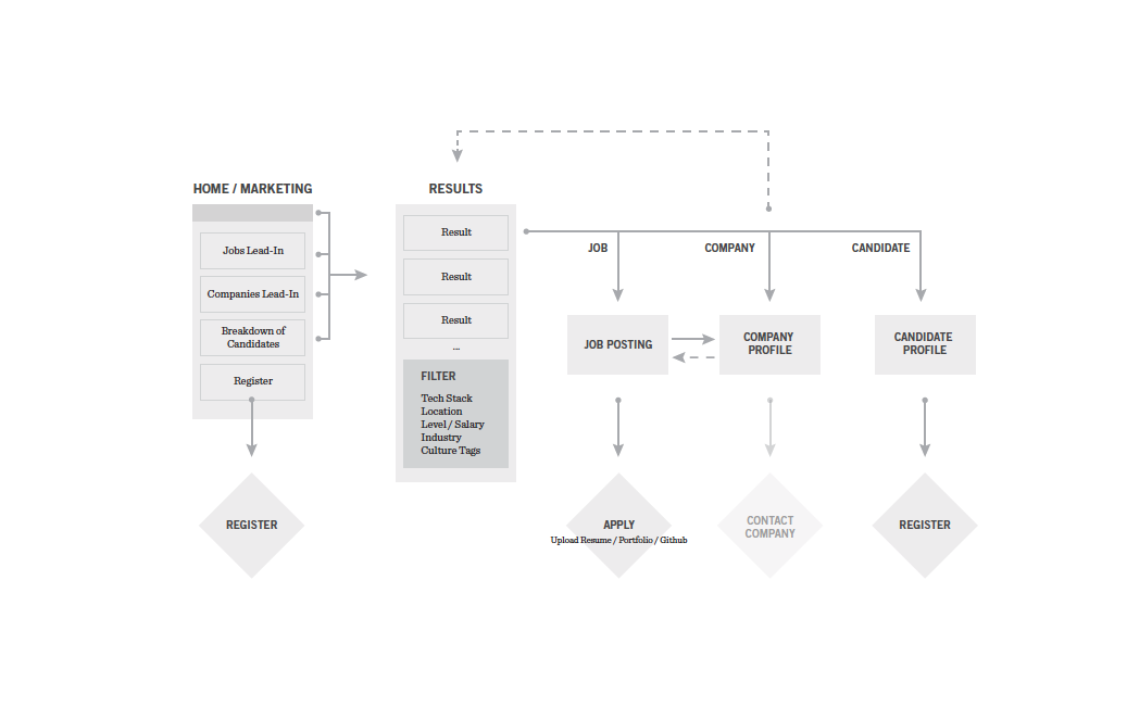
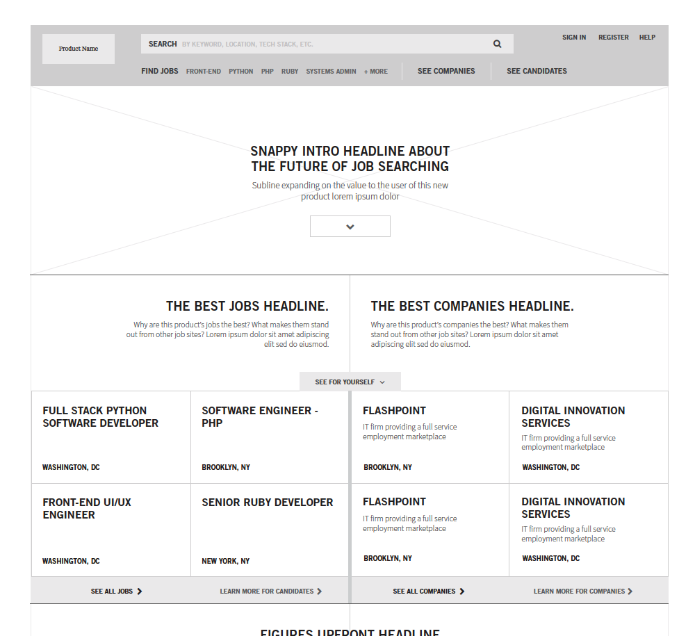
Framing a Navigation for Passive/Active Users

When going into a website or application, users are driven by two different mindsets: hunting (an active state when you know what you're looking for) and gathering (a more passive state to browse around and gather information). Users may switch back and forth between these states in a single session.

We needed to create a platform navigation that accommodated both mindsets. For hunters, search is critical. I made it a high priority and added suble cues in the search bar to indicate what parameters a user can take advantage of in their search. For gatherers, I wanted to highlight popular job types to entice the user to browse deeper within the site. At the same time, the navigation doesn't paint a user into any corners. It still encourages exploration, as any good navigation should.

Last but not least, we needed to ensure that the nav also spoke to companies who were already working with or interested in working with our client. "See Candidates" allows the former group to find talent they want to speak with while giving prospective companies an idea of the top talent they can expect to find. In visual design, we added in an additional specific callout "For Employers" to give them a targeted informational page encouraging them to reach out to our client to register.

The platform's navigation has something for everyone – Search includes helpful parameters for those on the hunt while the job type teasers encourage casual browsers to dive deeper.

The Right Tools for Technical Candidates

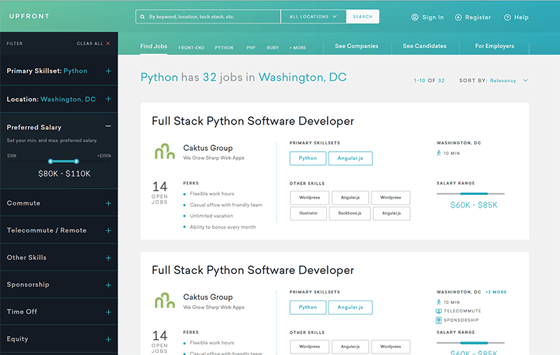
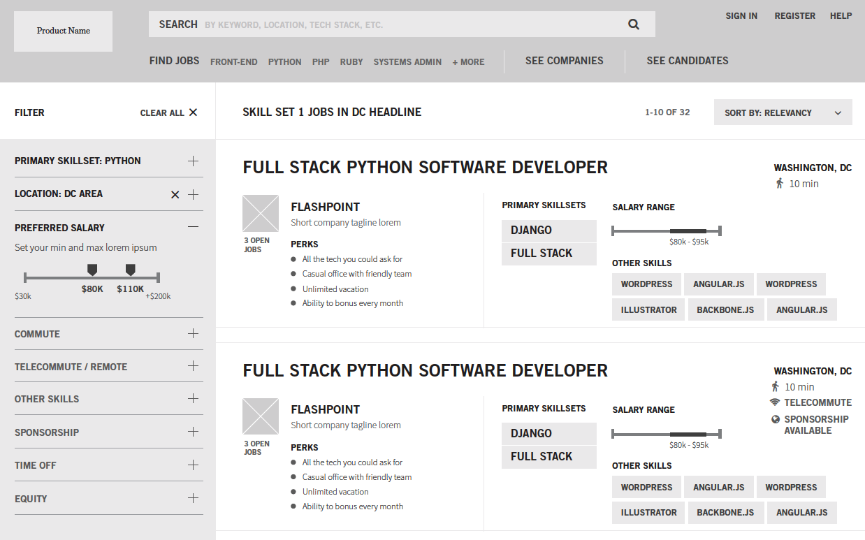
Anyone can attest that finding a new job can be overwhelming, even if you're a tech professional in high demand. When scanning through a list of job results, users would need enough information to decide whether to investigate a given job further. Too much information would inevitably add to their stress.

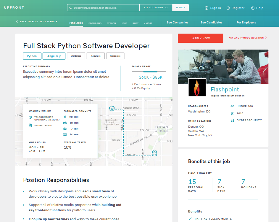
When architecting each job result, I included the critical information a candidate would likely consider at this first step: job title, company, skillsets, and location. With some space left, I added in some nice-to-knows like a salary range visualization that implies room for negotiation and a brief overview of company perks.

Each job result includes enough information for a user to decide whether to dive deeper while keeping it well-organized to prevent a state of data overload.

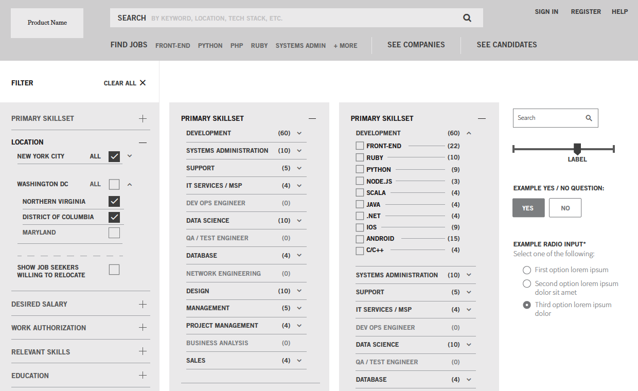
When it came to filtering, we wanted to create a competitive advantage by giving powerful tools to these technical candidates. No job search site had given this much leverage to find the exact positions users were on the hunt for. Filtering by skillsets, salary range, commute time, and equity was just the beginning.

We leaned into powerful filtering to give high-tech tools to our client's technical customer base. This shows deeper states of the Primary Skillset filter.

A Compelling Exploration in the Technical Job Hunt

Having built a strong foundation of information architecture, I worked with our visual designers to carefully translate the layouts into pixel-perfect mockups and pitched in for the responsive mobile mockups.

The client was thrilled with the finalized work and tested a beta build of the product with a handful of job candidates. They reported back with great results – decreased turnover time and less legwork for them.

Unfortunately the live version never saw the light of day as our client closed its doors within a year of engaging with us. Still, the project was an exciting venture in exploring what was possible in the technical job hunt.

I ensured that the visual design followed the principles of the wireframes and kept information well-organized and skimmable.

TL;DR Project Takeaways

A client approached our design agency with a desire to get their process-intensive recruitment online and into the hands of their customers. I created flows and wireframes that catered to both the technical professionals seeking jobs and companies seeking talent. Though all signs pointed to a successful launch, the company unfortunately caved before the product went live. However it was still an interesting and rewarding engagement in designing a cutting edge job search experience.

Thanks for looking!

Project presented by Jenna


Learn more about Jenna
Get in touch

See more of my work

The MotoRefi Upgrade

Website Redesign 2018

Every designer's dream: I got to tear apart my company's marketing site. Brand update, illustration, code, animation – I got to do it all!

View details »

Reimagining Wikipedia

Design Exercise 2017

I took a stab at reworking a Wikipedia article page. It was a fun personal project that allowed me to work out some visual design muscles.

View details »