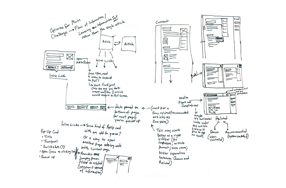
Wikipedia Reimagined

Design Exercise 2017

Project Summary
As an avid user of Wikipedia, I sought to make improvements to the organization and flow of an article page. I took this on as an exploratory exercise to stretch my design muscles.
Skill Areas
  • Information Architecture
  • Visual Design

Project Background

In late 2017, I had left a design agency where I primarily focused on information architecture. I wanted to push past the black and white world of wireframes and tackle a fun visual redesign exercise. What better place to start than the internet's free encyclopedia?!

When analyzing a Wikipedia article, it's difficult to be objective (given that we've all used Wikipedia numerous times). Knowing that, however, the thing that overwhelmingly comes to mind is organized chaos. You can find all the information at your fingertips but with the number of links and possible paths to go down, it's easy to get lost in a Wiki wormhole. I wondered if there was a way to better direct users to related people/things so they could dive deeper in learning about a specific topic. In addition, I saw a number of quick wins that would help improve legibility and liven up the page from its stripped-down appearance.

As with any design exercise, I want to strongly emphasize that the requirements and constraints of this project are IMAGINARY and idealized. The reality of product design is messy and far more complex than my hypothetical wireframes and mockups here could ever demonstrate. Please keep this in mind as you read through and weigh my take on a Wiki article. No users or clients were harmed in this redesign.

'Organized chaos' comes to mind when looking at Wikipedia's article page. I wanted to explore better organization and a way to direct users to learn more about a given topic.

Ideating for Deeper Knowledge

In redesigning a Wikipedia article, my primary motivation was to improve the flow of information within the page as well as between related topics. It's easy to lose yourself in the vast connections that Wikipedia promotes through numerous inline links. Take my example Jane Jacobs article, for instance. One could suddenly jump from "Jane Jacobs" to "Greenwich Village" to "60s counterculture" to "assassination of John F. Kennedy"... woah. Though it's fun to gather general information like this, it doesn't encourage a user to dive deeper into a specific learning area.

With pen to paper, I started ideating how to better promote a focused line of knowledge ("Urban Planning" for example). I toyed with the idea of allowing desktop users to open up a second article and lay them out side-by-side like a book. I played around with queuing up related articles to show a customizable path forward for users. The simplest idea is often the best, however, and I felt drawn to a sidebar that populated related people, topics, and more.

In addition, I wanted to show users a teaser of what's behind a given inline link in an article before they go clicking down a path that causes them to lose sight of what they originally came to learn about. I sketched out concepts for a pop-up that reveals critical information when a user hovers on any given link. This helps users by a) giving them a hint as to what the link means which helps them digest the current article, and b) shows them where that link will lead to better inform them as to whether to pivot. I was pleasantly surprised to see that not even a year after I sketched these, Wikipedia released their own version of this pop-up! Good design minds think alike.

I started by ideating on how to encourage users to dive deeper within a given topic rather than skimming through the wealth of random knowledge that Wikipedia offers.

Laying Out a Better Page

When it comes to the bones of a Wiki article, there's no changing the solid foundation: a table of contents, a table of quick facts, and the article itself consisting of headings, paragraphs, links, images, and sources. However, I wanted to create a better reading experience than the current version offers.

You may have noticed that the length of a paragraph line on a desktop Wikipedia article page can get long. The wider your screen, the wider the text grows. These lengthy lines harm legibility as most research has shown 45-75 characters to be the the ideal length for reading speed, comprehension, and comfort. On a 1366px wide desktop screen, for instance, most lines of the Jane Jacob article render at 120-180 characters long. In my redesigned article I reigned it in to ~75 characters per line, using a central column to create a more legible length.

In addition to a better read, I added in some quick organization wins. Slotting the table of contents into its own separate container allows it to scroll down the page as a user reads. This way they can jump around within the article as they see fit. I also aimed to better organize the quick facts card on the right side of the page. Wikipedia is doing some great things here but I wanted to give each fact more room to breathe.

The current left sidebar menu adds a lot of visual clutter with its lengthy list of links. So I tucked it all away in a hidden drawer under a "Menu" button. Again, this is a hypothetical redesign but in all the years of my usage and observance of how others use Wikipedia, I've never seen anyone interact with that sidebar menu as it stands today. This also gave me the advantage of freeing up room on the right side of the page for my sidebar of related topics.

I hit some quick wins by improving paragraph legibility and enabling the table of contents to scroll with the user. I also brought better separation to the quick facts table and hid the immense visual clutter added by the left sidebar menu.

Bringing It to Life

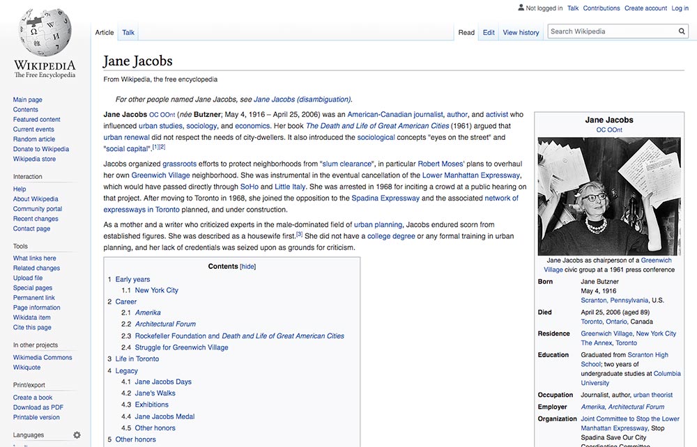
When considering the visual approach for the article page, I didn't want to stray too far from the look that most users have come to know and love. However, I did want to make the reading experience more fun and drive viewers to dive deeper into the page and topic.

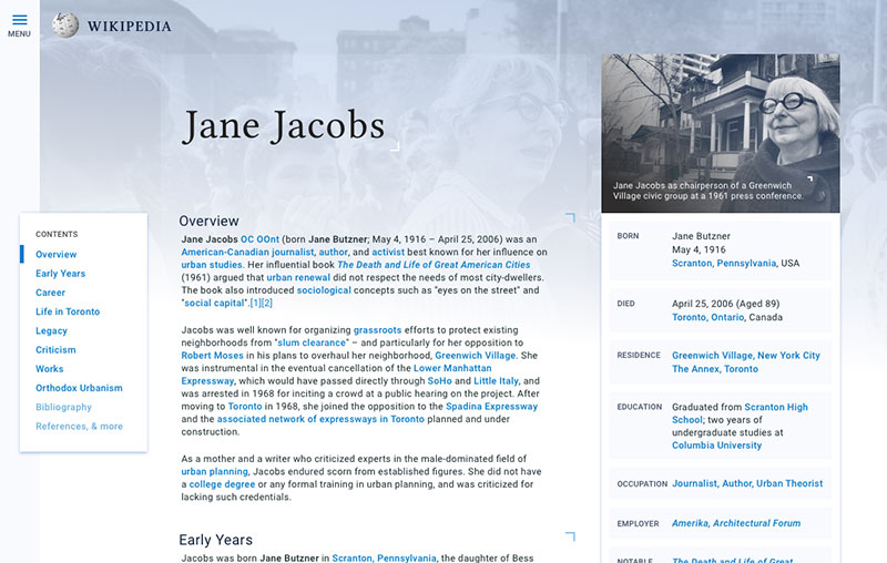
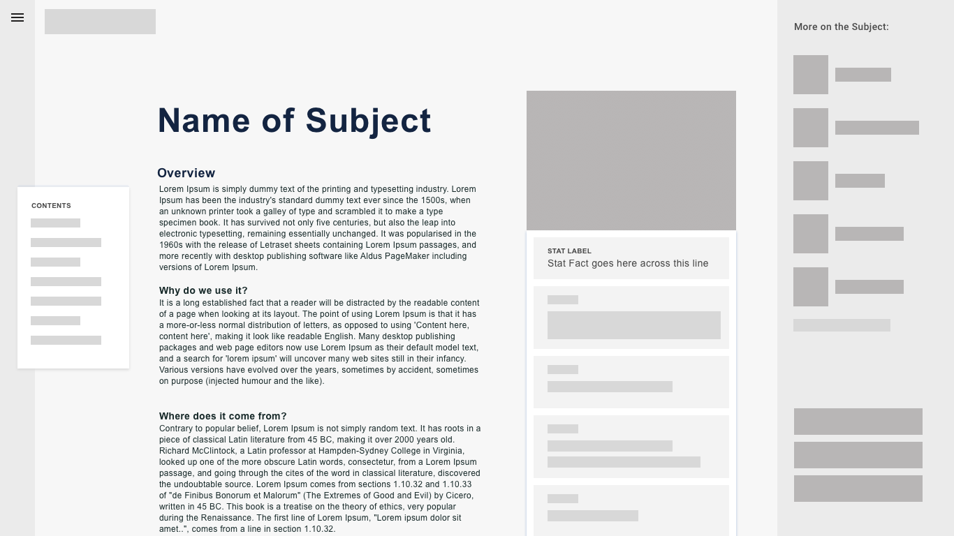
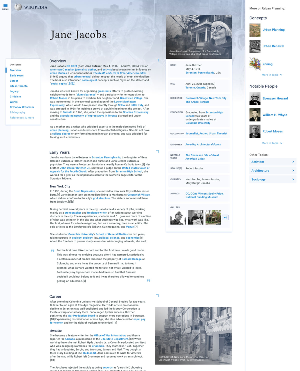
I started off by making the table of quick facts a card that feels as if it could stand on its own. Each piece of information lives in a container, emphasized by a light blue background color and a healthy amount of margin and padding to help separate it from the rest. This makes the facts easier to scan and parse through.

I applied the same card style to the table of contents, using a strike of bright blue to give the user a sense of place. The card style makes this an object with a trajectory, seamlessly traveling down the page alongside the user. Note that this table of contents hides the sub-contents, something that would need to be addressed in the next iteration.

Wikipedia stores millions of images and uses them throughout articles to illustrate the people, places, and things it describes. I incorporated a background image in the header to provide a more exciting introduction to the article. The blue-to-white gradient overlay ensures that it feels part of the brand and flows easily into a focused reading experience.

The right sidebar also brings in imagery to draw the user's eye to related content and get them interested in diving deeper into the topic as a whole. I broke the sidebar into "Concepts", "Notable People", and "Other Topics" to get as much coverage within a subject as possible.

When approaching visual design, I incorporated what already works well for Wikipedia with a new vigor for organization and deep learning.

Overall, I aimed for a well-organized reading experience that brought more excitement to learning something new. This redesign has a very narrow scope as Wikipedia articles range in length, content, and numerous other constraints. But I think it's an interesting experiment in creating topic threads that encourage deeper learning. Best of all, I had a lot of fun with it!

TL;DR Project Takeaways

In this exploratory redesign of a Wikipedia article page, I sought to tame the chaos with quick wins such as shortened line length for legibility and a pop-up card to preview inline links (which has since been implemented!). On a broader level, I experimented with ways to encourage deeper learning within related topics (whereas currently it's all too easy to fall into a Wiki wormhole of random articles). Though this hypothetical redesign is limited in many ways, it surfaces some interesting possibilities for the future of the internet's favorite encyclopedia.

Thanks for looking!

Project presented by Jenna


Learn more about Jenna
Get in touch

See more of my work

The MotoRefi Upgrade

Website Redesign 2018

Every designer's dream: I got to tear apart my company's marketing site. Brand update, illustration, code, animation – I got to do it all!

View details »

A Technical Job Search

Platform Design 2017

A client approached us to take their labor-intensive staffing process online. I led the information architecture and responsive visual design.

View details »